Monday, November 26, 2012

Tower-USB progress


I had already shown that I made my Tower-USB real. I had already printed and painted three towers and gotten the USB-sticks to make them. But so far I've only shown one, but my chair and mentor both also had one which weren't finished. So, a couple of weeks ago I picked them up, I made them and now I returned them. Here is a picture of all of them together:


When I was picking them up we had a meeting (with the chair and mentor) and we talked about selling these towers. I’m not really sure if it would pay of, but it is an interesting thought though. So I made some adjustments to the 3D Model and turned it into a printable file, which on my old laptop is a bit of a chore right now. But I managed and uploaded it to Shapeways!


This all went well (after about 5 tries) and it was time to see how it looked when it is printed in SLS (Selective Laser Sintering) in Nylon and Nylon with 20% Aluminium (Alumide). I ordered them and two weeks later I got them!


And together with the first one:


The all Nylon one is very light, but it also feels very fragile, the grey alumide one feels stronger. So I think I will use the alumide version and try to put the USB-stick into it. And then I need to put it on Etsy and Shapeways! Which can be quite scary because then I need to think of a brand!
But next week I’ll be done with that so I’ll show the results of it :)

cheers!
Frank

Thursday, November 8, 2012

Digital – Analogue interactions


Ever since I started this blog, or, actually the reason that I started this blog, was to develop an idea. When I started working with Arduino and other prototyping / digital tools there was this spark that lid some part of my imagination, but I never knew what to do with it. So I needed to bring more fuel to this spark. 
Anyway, later on I found that it is interesting to look at the friction between the analogue and digital world. We’re all turning into more digital beings, where our social lives are becoming more digital, our work is more digital and how we create things is becoming more and more digital. One of the results in the beginning of this digitalization is apples, then beloved and now hated, Skeumorphism. To lead new users into this digital world a lot of metaphors have been used to make it a quicker transition. We got our desktops back together with our files and folders. And we could fill these in with our trusty keyboard, the new typewriters.
This is all said and done before, but with the new smart phones and tablets coming you see a shift in what is possible. Now we have cameras and touch sensitive screens that help make the interactions much more intuitive. Also with techniques like the Kinect interacting with the digital world becomes more interesting.
Even though the interaction with the digital world is becoming more diverse, the way that the digital world interacts with us is mostly by images on screens and sounds. Of course we also have printing and now 3d printing, even though it isn’t really an interaction is it is a form of output.
So, where I’m trying to get, is that it is an interesting space to explore: the interaction of the digital in the analogue world. And I guess that this is where Arduino can be (or is) at its strongest.

Examples
This lamp exists out of 2 parts, one part stays at your house and the other in the house of your partner. When you touch it, it lights up, but because of an internet connection with the other lamp, that one also lights up, making your partner aware that you turned on your light. And when both lamps are on they both shine brighter.
It is a very simple concept but it lets you share an emotion with just an ‘analogue’ interaction.

This is a small cute printer that prints you tweets, new, puzzles or other things daily. To have a good start of the day. With you smart phone you can select what kind of prints you would like to get, and then you just need to wake up.
Again it is a deceivingly simple concept, but a great interaction. By tearing of the receipt like print, you have a nice way of getting your information. But also as it just sits and smiles at you when it is done. It is a great way for your digital world to become part of your analogue world.

This is a small Processing / Arduino based CnC Bot. It has a small hand which can grab something like a pen or small knive and it can move on three axes. It’s small and inexpensive at thus easily to get hold of and to start experimenting with.
I think this can be a very good way to let the digital world into the analogue world and to leave a trace. I’m not sure how the processing sketch will work, but with it you can probably also plug it into the web. and create cloud data based sketches! :)

Okay, I’m not sure yet where this will lead, especially since all these products are still a work in progress or just not for sale. But I’m going to try to find out more about it.

see you next week!
frank

Thursday, November 1, 2012

Tower-USB


Tower-USB

When I finished my master I had to do a presentation to present the work that I had done for my graduation project. Remember the research to the aesthetic preference to product metaphors? Well It’s kind of normal to give you mentor and chair a small present as a sign of appreciation, usually this is the normal to give something like a bottle of wine, or something similar. But I wanted to give something special, something I had designed during the project itself!
  

So this is the USB stick that refers to a castle tower to convey the message of protection of your data. For the gift I already made a printable file (which was a pain in the ass BTW!) and I printed them out at the faculty :). And I bought very very very small USB-sticks to put into these towers. So far so good, expect that I still needed to finish my presentation and didn’t have any time to work on it anymore. So in the end I ended up giving the tower and the USB stick separately, with the promise to finish it after my graduation.
I had one for myself to make first, as an experiment and then I would make that of my mentor and chair. But I lost mine, during the time that I moved from my student room to my parents place. And I searched and searched in all the boxed. But today, I found it in a very small insignificant box. So this is what I had.


The USB-stick doesn’t fit at the moment because of it’s large behind (how polite) but it was easily removed by giving it a bit more space by means of sticking a screwdriver between the USB part and the black part.


To make the hinge, I drilled too small holes into the tower, and also carved a little into the metal part of the USB stick. On that little hole I added solder and attached a small part of some wire. Then I cut the wire until it is very small and put it in the tower. 


I needed to make more space in the tower at the holes to make up for the extra solder. Also, the USB stick is a little bigger than I anticipated, so I needed to make the ‘gate opening’ slightly bigger so it can turn inwards. So here is the result:


And when connected.


Next week I’ll talk about my website, and maybe about some theory?
cheers!

Tuesday, October 9, 2012

My graduation Project,


To finish my masters in Design for Interaction (DfI) I needed to do a graduation project. This is a project that takes about a semester and is usually a design project done for a company, but there is also an option to do a research project at the faculty. When searching for an assignment I found a project to do research on product metaphors. It was still very vague but I liked the idea of looking at product design from a new perspective: using metaphors. Up to then my idea of a metaphor was a figure of speech, which combines two ideas into a new idea.

When I started talking with my mentor (Nazli Cila, a PHD student doing research on Product Metaphors) and my chair (Paul Hekkert, Professor and chair of the Design Aesthetic section) it became apparent that there was already a lot known about product metaphors and metaphors in different forms. An exploration would not be very useful so it would be better to come up with a theory and see if that would be true. The theory we came up with was the following: a product metaphor becomes more aesthetically pleasing when the source (reference to the other idea) is novel yet, comprehensible and when the mapping (how the source is presented in the product) is subtle, yet identifiable.

Okay, so lets break this down, George Lakoff and Mark Johnson came with the theory (they are kind of considered to be the ones that made this theory big) that metaphors aren’t some strange things only poets make, but that it is actually a very central part of our mental process. It is our way of understanding something by means of something else. So for example when, in Skakespeare’s “Romeo and Juliette (?)”, Romeo says something like “… Jullia is like the sun…” we know he doesn’t mean that she is a flaming hot ball of fire many times the size of the earth far away. But our mind can turn that around and link only certain properties from the sun to Jullia: being bright, radiant and warm. This selection and transfer of these properties is called mapping. But the esmaple “Temperatures are rising” is a metaphor, temperatures don’t rise, not physically, but because we plot them on graphs we know that when it gets warm, the line goes up, so the temperature ‘rises’.

There have been lots of theories on what makes a good metaphor, some say that the source (in ‘julia is the sun’ the sun) and target (Julia) need to be conceptually very different, this means that these concepts don’t have much, if anything, in common. Others say that they need to be as similar as possible for the metaphor to be good. It seems that there is a truth in both of these theories in that when the target and source are too different people won’t understand it, but when they are too similar it won’t be seen as a metaphor. It might just be that both sides are talking about something different. First of all a metaphor needs to be understood, because else there is no interpretation, so this is why the target and source need to have some similarity. But it also needs that bit of creativity, that spark of brilliance, which is described as being conceptually different. So there probably needs to be some sort of balance between both. Tourangeau and Sternberg have a very nice theory about it. (look it up J)

This idea of metaphor has been researched or talked about in a couple of different forms: newspaper cartoons, art, advertisements and movies. Product metaphors is a subject that hasn’t been published a lot about, but most of the subjects, as stated earlier, have some similarities, so a lot could be learned. First of all, a metaphor needs to be found by an observer, this sounds quite obvious but if nobody sees it there is no interpretation and thus no produced metaphor. Also because every person is different in terms of background and culture, it is inevitable that different people have different interpretations of the metaphor. This might even lead to an interpretation that the producer of the metaphor didn’t envision.


Anyway, with all this information I set out to do a study, I took 60 product metaphors (a couple presented above and left) and let 60 participants rate them on: novelty, comprehensibility, subtlety, identifiability and aesthetic preference. The participants were all students in the Netherlands recruited either by social media or colourful posters at the universities in Delft, Utrecht, Leiden and Amsterdam.

The results were very good! After some statistical analyses, I found out that all four factors (novelty, comprehensibility, subtlety and identifiability) influence the aesthetic appreciation in a positive way. In the graphs below I plotted the novelty against the comprehensibility and the subtlety against the identifiability, where the bigger the dot the bigger the aesthetic preference. There is a very interesting effect between the novelty and comprehensibility because you can see that the ones that are high on both also have a higher aesthetic appreciation. The graph of subtlety against identifiability shows this is a far lesser extend.


So, this is great! But then again it might be good to dig deeper into the contrast of subtlety and identifiability, and there is no better way that to design the products themselves J. So the idea was to create to product metaphors 
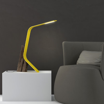
and let them vary on subtlety and identifiability. The first one was a coffee mug that refers to a Koala Bear to convey the message of warmth and friendship. 
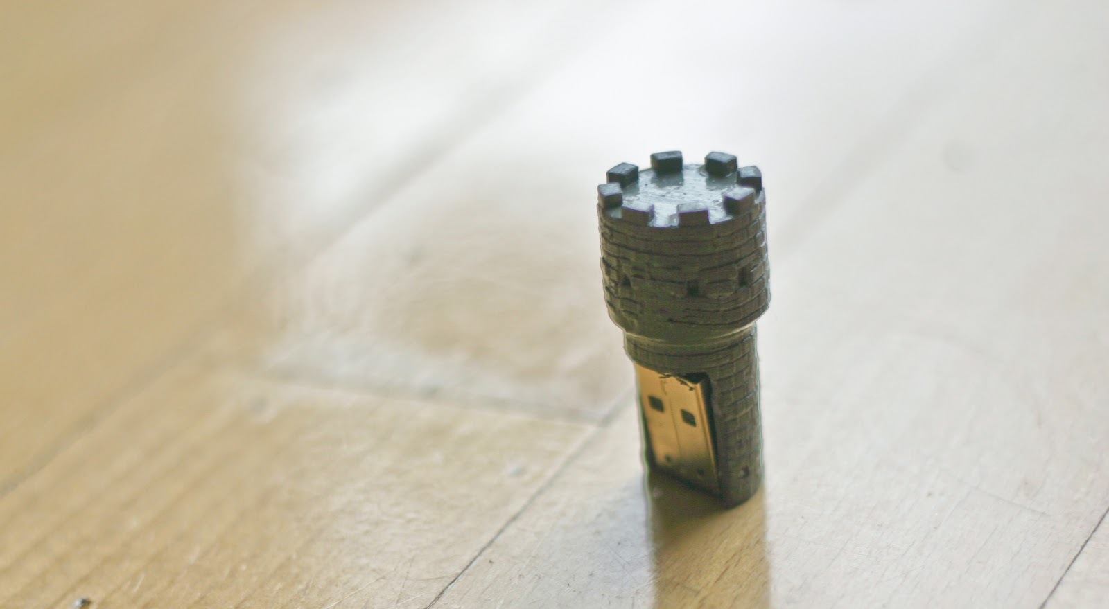
And the second one was an USB stick that refers to a castle tower, to convey the message of protection of your data. Below are the variations.


From this study I found that identifiability has more effect on the aesthetic appreciation than the subtlety. So this confirmed the results of the first study. But looking further I found out that the highest appreciation is found then the identifiability is high, no matter how subtle. But when the identifiability is lower it needs to be more subtle. I guess that this means that people like to see what a product metaphor refers to, but if it isn’t clear, it should be pushed away. Does this make sense? (Ah well, nobody that read it..)

At the end of July I presented this work and finshed my studies with a whopping 8.5! J So, needless to say I was really happy with it.


I’m not sure yet what I’ll do afterwards, it has been 2 months since, and still I haven’t decided if I would like to do research or designing. If it would be possible I’d do both, I seem to like to write, but maybe what I write about isn’t that good… J But this blog might lend itself more to that: I like the analyzing of other products. So I hope maybe instead of showing process on one of my projects, I might give my thoughts on some projects and learn something from it J.

anyway, this was it, see you next week J. (hopefully a bitless writing :))
Frank

Tuesday, September 25, 2012

Birth of a long board


This is my first blog post since my graduation, but before I will talk about that there has been something that I wanted to post about for a long time. I already stated it earlier but now it is for sure, I finished my new long board. Las year I also tried to make a long board, but I didn’t invest too much time or money into it and it sucked. It bend through way too fast. Also I didn’t have any money for the wheels and grip tape, So I never used it.
This year I had more money and with the good weather the urge came to ‘flow’ over the concrete with the sun on my face. So I decided to first buy the wheels and grip tape, and then to work on a mold to make the board. So on a national holiday I decided to begin immediately. First I needed to cut all the wood for the mold.
 
I then made the mold so that the board would be curved in the length. This creates a very nice stiffness (or so the ‘internet’ says) but it also takes a lot of force to bend the wooden plates into this curve. To make it easier to bend the wood I bought 3 multiplex plates of 4mm thick that will make the board. The mold has two beams on the outside that push the plates up, and there is a beam in the middle that push the plates down. This will create the curve that we need.
 
I glued the plates together with Epoxy that I had left from the first long board. So first all the wooden plates got a layer of glue and then I put them together on the mold.
 
This is what it all looks like in the mold.
 
And this is a detail of the curve, but also a small sketch of how I wanted the finished product to look.

The collage here shows the process that came after. First I unscrewed the mold so that I would be able to take out the board. But no such luck, the epoxy also got between the mold and long board, so I needed to saw of the long board. Then I drew up the shape of the board, that I made in illustrator and then printed out, and later I sawed the shape out of the plank. Then I sanded and shaved the wood to get a nice finish and to get rid of the remains of the mold and epoxy.
 
For the graphics I took inspiration from this video:
I created a (sort of) random pattern and used paper tape to make the pattern and sprayed the colours on it. Then I used a lacquer to finish it of, but apparently I got a wrong lacquer that has a ‘cherry’ colour. But in the end it looks alright. Finally I applied the grip tape and added the trucks and wheels.
 And here is the final result :)
 
I really like it and I’ve ridden it a lot, but I still need to practice some more. :)

Next week I will talk about my graduation subject and everything.
Frank

Thursday, May 24, 2012

Berlin trippin

Wow,... I didn't imagine that it would take me this long to update again.

I didn't continue my work on the watch, But I will continue on it later on. Up to now I've been busy working on my graduation and some other projects. My graduation is going really well, The research is finished and my mentor and chair are happy with it. Now I'm writing the research paper, which is taking longer than I expected, because Writing isn't going as fast as I planned it to. But it's coming so everything is good :).

In order to make more sense of everything I've done I'm going to do a post per subject. This post's subject is about my trips to Berlin, next post is going to be about a new longboard, which is now drying of it's paintjob :). And I guess the post after it will be about my graduation project.

Last time I posted it was before I was going to Berlin with some friends to visit Ridzert and Alexandra (Linky!) And it was really fun! and in the footsteps of a movie I made of going to Goettingen, I made 1600+ pictures and put them all together together with a nice soundtrack.
So,... exited??? :)


But of course that is about 3 months ago! so in the mean time new plans have been made, money has been gathered, cars stolen and minds set, we set out for a new trip! This was two weeks ago, and it was really nice to see Ridzert and Alexandra again :). So again:
Are you willing to see the second video? :)


The soundtrack stops a bit early, which is too bad but I like it in general.

I like this style of video making, And I definetly plan to do it more often. But my next trip, that I will make to Palermo will be different. In Palermo I'm going to meet with some friends from Lisboa and I will fly with Ryanair. And Ryanair kind of restricts me to travel a little bit more compact, so I'll bring my video camera!!!! it's smaller and has more memory, meaning more awesomeness. But it will be difficult to do this right, so it will be interesting.

Okay, so that is it for now. But come back soon.
I will :)

cheers!

Thursday, March 8, 2012

Watch.... progress

Hi!

First I want to show you some awesome stuff that I found the last couple of days.


The first one is Transcendenz, I only saw the movie, but it is a really cool concept of how to let the user investigate philosophy and the world around him and her. I'm not sure if this product would be used for a very long time, but it seems like an interesting concept that might also work on a smartphone.


This video is also really cool. I like the conceptual or human touch to the data by which it completely transforms. ah well, it is cool :) not much to say :).


And here is an Awesome lamp!!! I like the contrast between the two materials and the form language.


Okay, and lastly this awesome project should come out soon (or at least I hope :) ). It's called Piccolo and is basically a very small CNC machine. Though I don't think that you can use it for tooling, but I guess it will be awesome to create processing sketches for it! I can't wait!

Right, now for my own project, the watch:


Lately I've been telling how I was cutting small pieces that would fit together to create the body of the watch. This takes a lot of time to create manually, I tried to do this in this way to kind of recreate the laser cutting look, which I somehow was going for. But after weeks of sometimes working on it I got tired of it.


So I did it another way which takes less time and gives a better result! Win/Win!!! So now I should plaster the whole thing to create a smooth finish and spray it white. Then I'll add the wooden sides and bottom. You'll see how it will be finished. Just wait :).

But it will have to wait a little because this weekend I'm going to Berlin to visit a friend.
:D

so see you next time!

Tuesday, February 28, 2012

hmm....

Okay, so again I didn't post anything for a while...
Somehow I've been quite busy with lots of stuff and I haven't really found any time to do much.

To do show you something I made this:

I used one of my old photo's and made this small animation on it. :) again it is in the style of Dmitry Maximov. I hope you like it :)

Then I continued further with my watch!, I got nothing to show yet, which is also a reason for not posting yet, but hopefully I can make some pictures soon.
In the meantime I found this site:
M E M E N T O

It has an awesome look, And I'm seriously considering to apply something like this to my watch :)

Graduation is also coming along, I hope to bring out a questionnaire soon. Which I will also post here, Just in case :).

Monday, February 6, 2012

Too much things and not enough time.

Hello!!

I guess it has been 2 months now since I posted anything over here. I guess it has been good, but then again it hasn't been very productive. The reason that I didn't post anything anymore is that I got kind of overwhelmed by all the things that I needed to do for me, my graduation project, and my social things. And because of this I was just running from place to place to get everything covered. But it wasn't really nice.

So now, with the new year I decided that I should slow things down a bit and don't do to much. So I stopped my sports, I do run occasionally (but not in the snow). And I started to work less at IKEA, which helped things a lot!

'But', you might ask 'Then, if you changed all this at the beginning of the year, why the hell haven't you posted anything yet?' (Ok, this doesn't make that much sense as it did in my head... but anyway :) ), Well I also needed to move from my old trusty home! So all in all I just recently started to do some cool things again, which I will now show you :)

First of all is something that I always wanted to have done in my life and that is to make an elastic band ball!


This takes painstaking hours of work and concentration (read the irony! :) but it did take hours!) to pull this together. The label of the elastic band package told me it were about 120 elastic bands, so that is what I'll tell you :). it is a 120 elastic bands elastic band ball!

I also once found that art of Dmitry Maximov, which is really cool. Especially his use of colours, photos with lots of depth of field and the contrast of the images. This made me think that it would be awesome to create something like this as an animation.
So this is what I did :)


Here you can see the result: a bit shaky. But I like my first try :). Also you can see my new room in it, although maybe you don't really see it.... but that is my new room.

So that was all!
till next week! :)
cheers!